Your Man's Take on the Ren Square Design
Last night, your Man About Town was in full effect at the public unveiling of the "final" Renaissance Square design at the Clarion Riverside Hotel. No, I was not that dashing older gentleman at the front of the room. That was Moshe Safdie, the world famous architect for our city's most 'wow' development since God created the High Falls. But as Safdie pointed out, I should be wary of 'wow' as the true value of architecture is not in the initial reaction, but in the lasting effect it has on a city and its people. I think most any reasonable person will agree that this project will have an extremely positive lasting effect on Rochester, and quite a bit of 'wow' as well.I was very worried heading into the event with all of the talk about cutting elements of the design in order to stick to the $230 million price tag. The situation was eeriliy reminiscent of Frontier Field opening without a roof, Blue Cross Arena opening without a videoboard, or Paetec Park opening with a trailer for a box office. If we're going to spend gobs of money on on a major public facility, can we please get it right the first time?!!?!?! Those fears were calmed quickly as a cool and confident Moshe Safdie took the stage to review the project. Firstly, none of the major elements of the complex have been eliminated or downsized. The bus station will accommodate the same number of buses, the Broadway roadhouse theater will still be 2,800 seats, and the MCC campus will still be large enough to accommodate an expansion of program offerings (and students).
Secondly, no "essential" features were cut from the design. The main change from the last design was the removal of a curved glass ceiling over the MCC courtyard. While that would have been a 'wow', it would have also further isolated the complex from the street life on Main Street. Now, the courtyard will be open to the air and open to the street. The other noticeable change is the slight downsizing of the black box theater from 500 seats to 200. If that works for the arts community, that works for me.
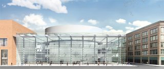
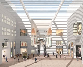
Finally, the designs speak for themselves. Below are a couple of pictures taken from WHAM-TV; I assume the entire presentation will be available on the Renaissance Square web site in the near future.


The glass-enclosed lobby of the Performing Arts Center is truly a gem. In geekspeak, it is simple yet elegant; in Rochester-ese, it's freaking sweet. This design brings abundant light and energy to what is now a dark and dreary corner of downtown. Another cool rendering is one that was not available online - the view from Stone Street looking north to the "urban room" or main entrance to the complex. The extensive use of glass gives the impression that Stone Street continues along its former axis north towards Andrews Street, and the design allows pedestrians to make that movement once again - through Renaissance Square. This will make Stone Street a very cool little street with Albert Paley's Genesee Passage to the south and Renaissance Square to the north. Maybe a restaurateur will make a go of it at the former Stone Street Grill.
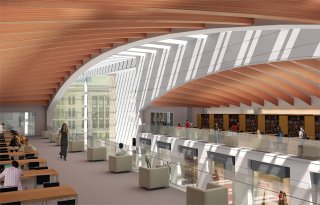
No design is perfect of course. I am not wild about the use of red brick on the two front buildings as seen in the Main Street elevation. These buildings, as they are presented above, are far too similar to the buildings found on the drab and unexciting RIT campus. While I can appreciate the desire to blend the new buildings in with their surroundings, I would have preferred a stone exterior to echo the Granite or Alliance Buildings. Hopefully the renderings do not do these buildings justice. My other criticism is of the MCC library/computing center (fourth picture). I hope that the final design encloses these rooms in glass as I'm sure students would prefer not to be disturbed by the inevitable yelling, laughing, etc. of the bus patrons and general public milling around just two floors below. This would be an excellent concept in a fully academic structure, but in a public building such as this, it could have a negative impact on the learning experience of MCC students.
All in all, I came away from the presentation thoroughly impressed. My criticisms are minor while my support for this project remains undeterred. While I still believe that the mid-sized theater must be built on the site of the McCurdy Building at Midtown Plaza if we are going to maximize the public benefit of these projects; that is another battle for another time. Demolition for Renaissance Square should begin in earnest this Spring and construction should be complete by Fall 2010. Those four years can't come soon enough, for me, for you, and for our city.